|
Orange You Crazy for Warm Tones? Ever notice how red is a popular dining room color? That’s no coincidence! Colors that energize, such as reds, oranges and bright yellows, are perfect for rooms centered around the preparation and enjoyment of food! But don’t assume that all warm tones with a rosy or orange-y glow should be kept out of living and sleeping spaces. Calmer versions of these hues, such as coral and peach, make a lovely addition to the most tranquil of rooms. Why? Because coral evokes the beach, and who doesn’t feel rejuvenated by a journey to the ocean? There are also bright versions of coral that make a unique, joyful statement in the home, as shown by the living room below. [from Easy Living] 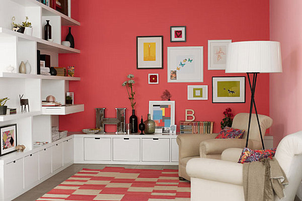
Peach is soft like the lightest hues in the sunset, and it blends well with sandy shades, as well as (of course) coral! Though the bedding below is ultra bright, the gentle wall color keeps this bedroom serene. [from Blue Sky Building Company] 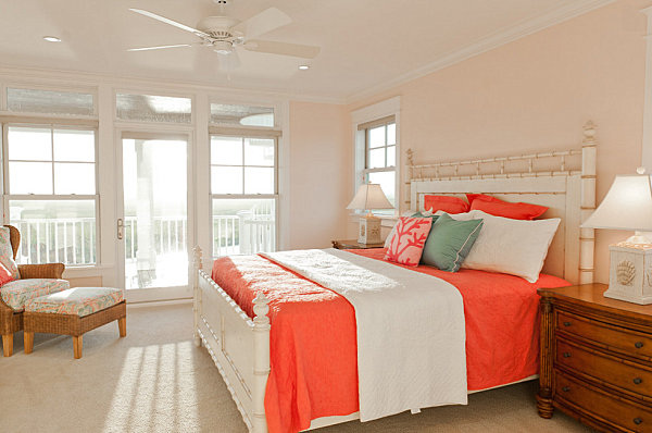
Coral can veer pink, or it can veer into rusty shades, as shown by this next featured living room. What a gorgeous blend of rich peach, warm coral, rust, sand and gray! This space is happy, energized and chill at the same time… [from S.B. Long Interiors] 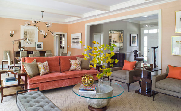
Coral also beautifully combines with blue, especially shades of navy. Not only does this blend create an elegant look, it makes a nautical statement that once again evokes the rejuvenating power of the beach (or the elegance of a sophisticated beach hotel)! [from S.B. Long Interiors] 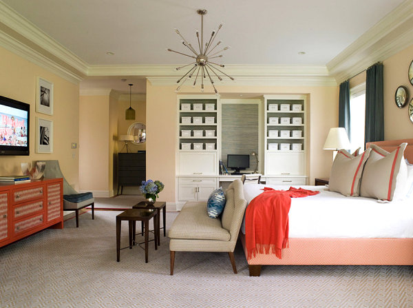
The same upscale look applies to the combination of peach and navy, which seamlessly integrates a warm glow with a rich, solid shade of blue to accent the room at hand. [from Irene Turner Interior Design and Renovation] 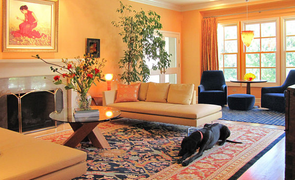
Tranquil BluesShades of blue are soothing, steady and powerful (but in a chill way). Not to mention, they combine well with blue-gone-glam hues such as lavender. Notice the touches of coral in the room below as well?! [from S.B. Long Interiors] 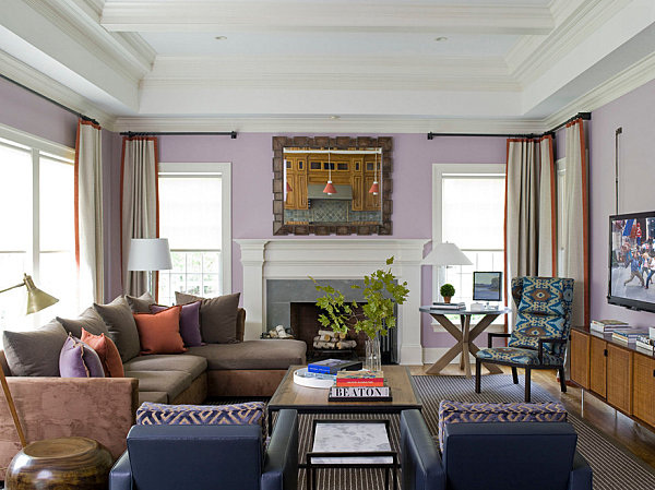
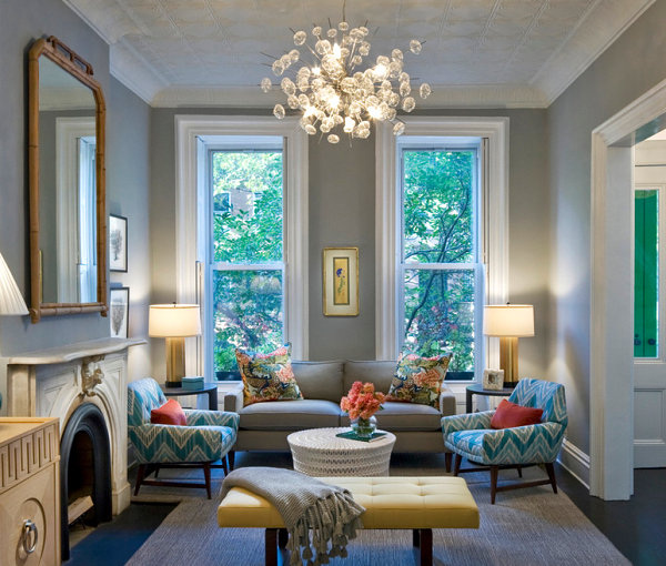
Royal blue is regal, isn’t it?! This strong shade can be accented with a range of colors. We love how the next featured space tones it down a bit by going with unexpected pops of color in hues such as green, brown and pink. [from Easy Living] 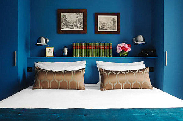
In fact, there’s something about a srong shade of blue that’s, well…. interesting. Call it decadent or enticing. Rich shades of blue definitely take things up a notch in a way that is both calming and evocative. And when your space demands a second look, it’s definitely a winner! [from Vanessa DeLeon Associates via Zillow] 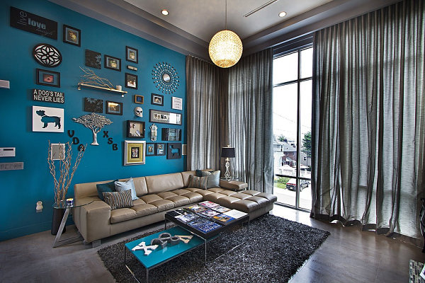
Flowing water is relaxing and heavenly, isn’t it? And there’s just something heavenly about the Angela Adams rug below. Like a fairy tale land where bubbling ponds hold scores of happy fish, this rug has a blissfully natural look that also channels the waves and foam of the ocean. Maybe that’s why the rug is called “Ocean“! Undeniably calming, it also invites you to escape, and that’s just the kind of vibe you can’t help but desire in the living room… [from Lulu Designs Online] 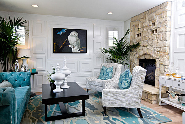
We now head into blue-meets-green territory, beginning with the deep teal living space in the next image. Once again, we have a rich, extravagant look that is also calming, thanks to its understated yet powerful feel. Note how furniture in shades of cream is the perfect counterpart to the shade on the wall. Also note the lovely way gold accents blend with this space. [from Design Crisis] 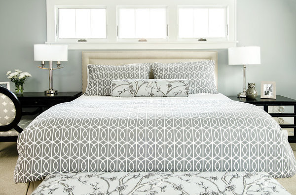
0 Comments
Your comment will be posted after it is approved.
Leave a Reply. |
NellyLoving flowers, design and arrangement. Archives
June 2017
Categories |
 RSS Feed
