|
Crisp White Table Lamps We begin with a refreshing white-on-white palette. These crisp lamps pop against rich, colorful walls, as shown in the bedroom below. The space features the Ada White Table Lamp from CB2, which showcases a tulip base, a drum shade and Finnish styling… 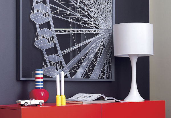
With a monochromatic palette, many of these white-on-white lamps introduce a sculptural element that adds interest and flair. The Urchin Lamp in White from DwellStudio features a white ceramic base, as well as a white linen shade. Ideal for creative spaces, the piece is a work of art in itself! 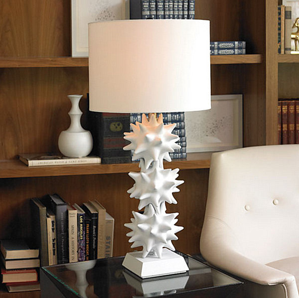
Rounded forms take center stage in the Alexis Ceramic Table Lamp Base from Pottery Barn, crafted of iron and ceramic. The shape of the piece works well with a drum shade, as shown below. Not to mention, the lamp base is available in three colors, including (of course) white: 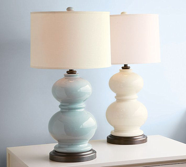
For a nautical touch that will bring summer memories to the boudoir all year, check out this Seahorse Table Lamp from Jonathan Adler, made from unglazed porcelain. It’s hard to imagine a more perfect setting for this piece–against deep blue wallpaper boasting a sea-worthy rope and knot motif. The perfect choice for a beachy, whimsical bedroom! 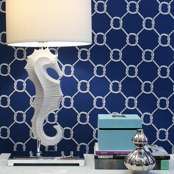
Golden Bedside Lamps This is the year of the gold revival! Warm tones have hit flatware, furnishings, accessories and more. Are we surprised by a fresh batch of gilded bedside lighting options? Of course not! The Mia Abacus Table Lamp with a Bronze Finish from West Elm combines the best of white-on-white design with touches of gold, thanks to a glass sphere and an iron base with an antique bronze finish: 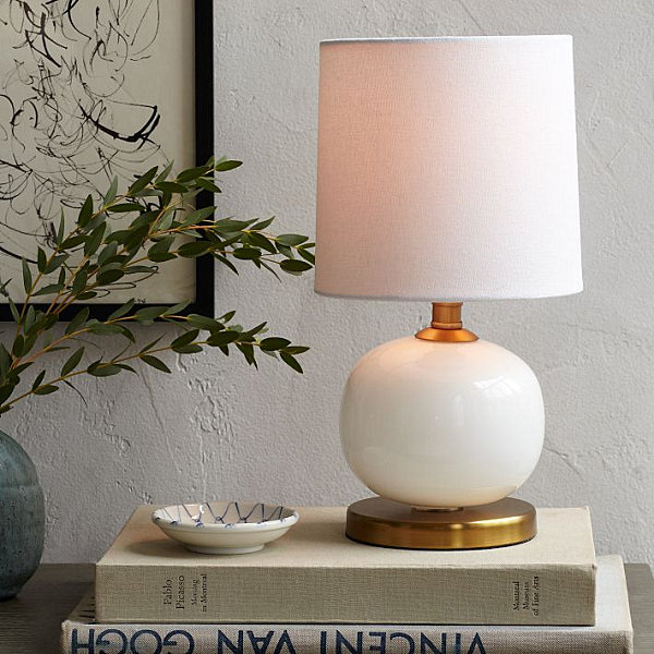
A blown glass base and white linen shade give this piece character, as does its Mid-Century look and eye-catching rosy hue. 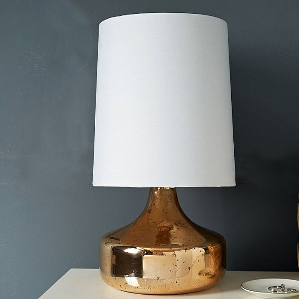
Boxy and bold, the Lubna Chowdhary Tiled Table Lamp in Bronze from West Elm is named for the talented British designer who created it. Featuring vintage-style tiles that are hand painted in a reactive glaze, the lamp makes a grand, luxury statement that adds architectural interest to the boudoir: 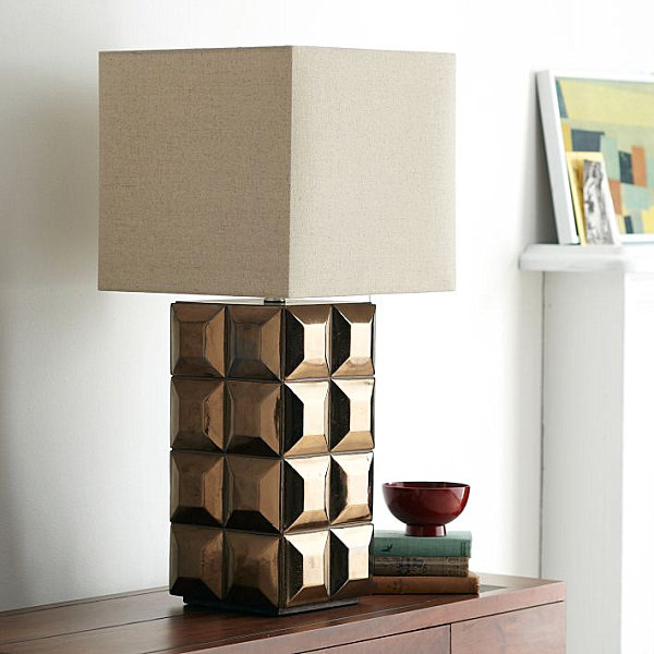
For an industrial look, check out the Grant Table Lamp from Crate & Barrel, complete with welded edges and a bronze tone. Although shown here on a console table, it would also make a fabulous addition to your sleeping space… 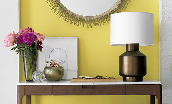
How about the way it delicately graces a bedside table while leaving plenty of room for other items, such as reading materials, a glass of water, and a vase of flowers? 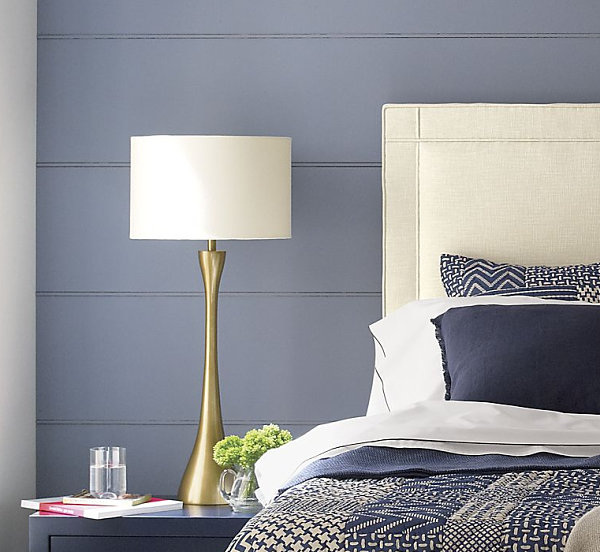
from Create & Barrel, the Cleo Table Lamp is the perfect blend of Mid-Century design and nature-inspired style. A brass base and an ivory shade are the materials of choice… 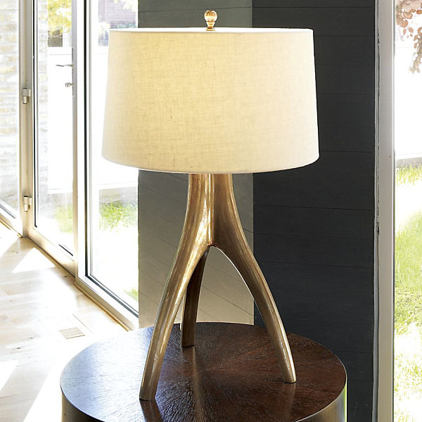
Sunny Yellow Lamps We now move on to sunny yellow selections that reflect one of today’s hottest accent colors! The Atomic Yellow Table Lamp from CB2 is striking in its design, its over-sized mod shade, and its vibrant yellow powdercoat finish: 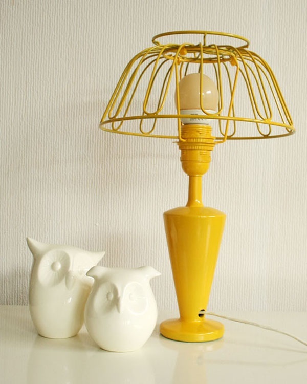
From Jonathan Adler, the Santorini Electra Table Lamp consists of a rich yellow shade, gold detailing, and a marble base that anchors the piece in stunning, solid white. This lamp is particularly gorgeous when displayed on glass or acrylic tables… 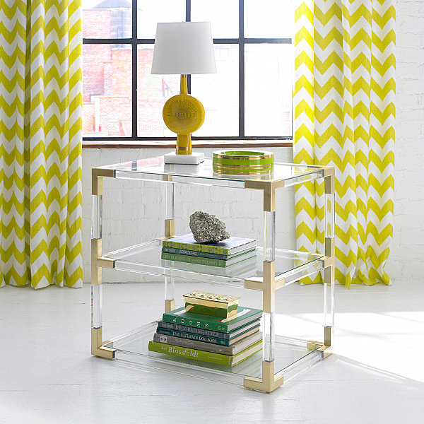
Lamps with Crystal Details Our final featured group of table lamps makes it clear that crystal is in! A dash of instant glamour. An elegant nod to retro style. A neutral touch that also manages to be bold… The Tower Lamp from DwellStudio features a crystal base with a linen shade. Love that Deco style! 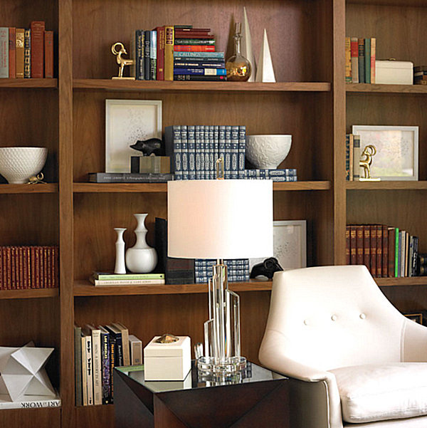
The Crystal Hexagonal Column Table Lamp from Restoration Hardware is stunningly sculptural. With a timeless look that can easily veer retro or modern, this piece is available in both crystal and metal… 
The Carlotta Faceted Crystal Accent Lamp from Pottery Barn boasts a luxe look that beautifully integrates into glamorous bedroom spaces. Not to mention, the compact design of the piece is perfect for small nightstands: 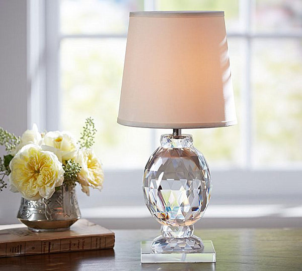
We end with a real showstopper! The 1920s Odeon Glass Fringe Table Lamp from Restoration Hardware features a marble base, as well as concentric rings of prisms. Bring on the Deco, and bring on the light. If you want your bedside reading lamp to be the focal point of your space, this is the piece for you! 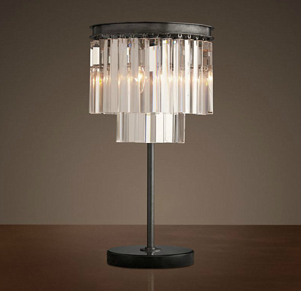
0 Comments
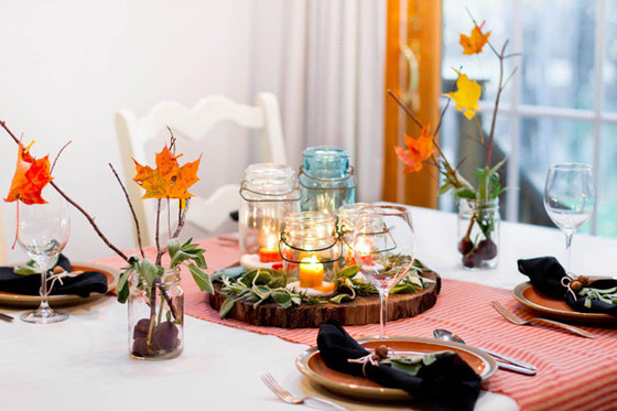
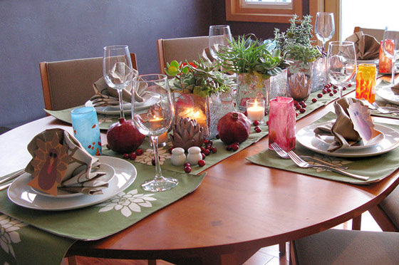
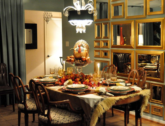
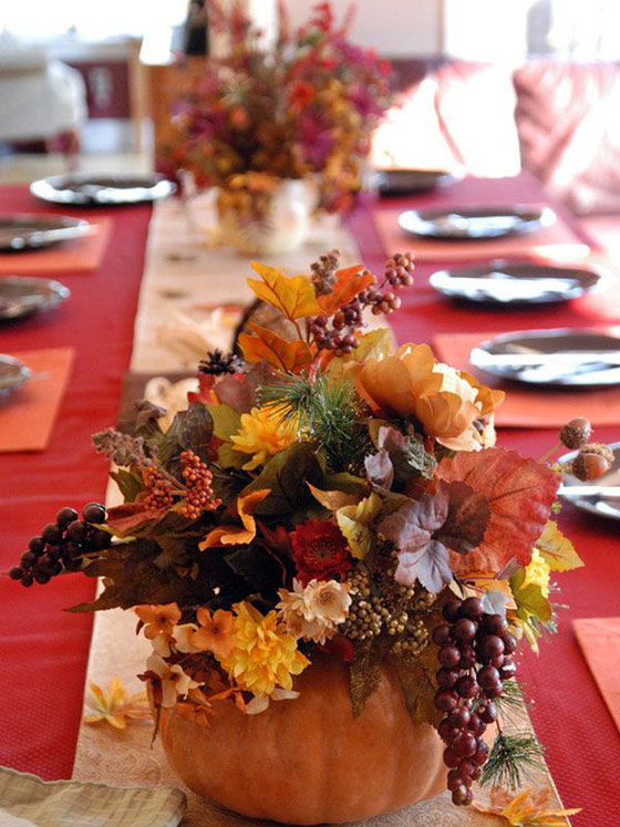
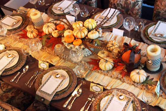
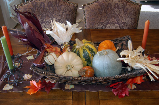
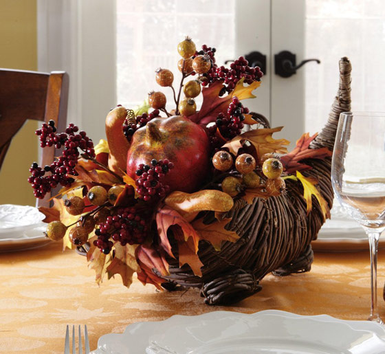
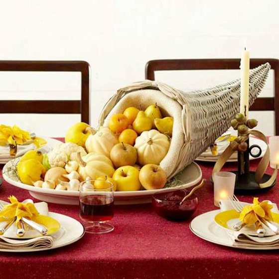
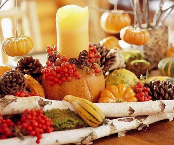
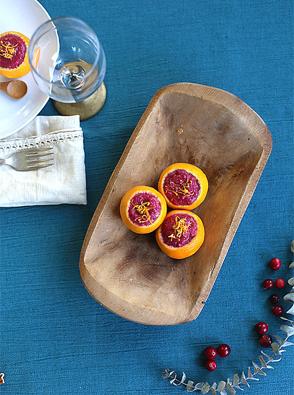
Thanksgiving, as the festival that is all about celebrating nature’s pomp and glory, it is the ideal time to deliver some natural goodness to develop a vision of bounty. When comes to the ideas of table settings and centerpieces, there are plenty of choices: baskets of gourds, fresh fruit or acorns; all kinds of candles; colorful table runner printed with autumn leaves; actual dried leaves with a string of tiny pine cones, pumpkins and pomegranates; turkey pattern folding napkin and tall cranberry-toned tapers with red glassware. Here we have rounded up 30 Beautiful Thanksgiving Centerpiece Ideas for a stylish holiday. And it is your time to use your imagination and express your gratitude for this lovely holiday. 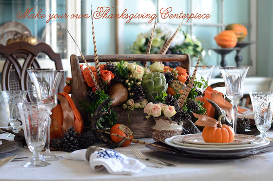
1. Know where to find good deals on new items. Our first design tip involves knowing how to bargain shop. Become familiar with the retailers that consistently offer durable, well-designed pieces that are also affordable. Your go-to retailer may not be the first choice of your best friend, but all that matters is knowing what works for your budget and your style. One consistent favorite: IKEA. 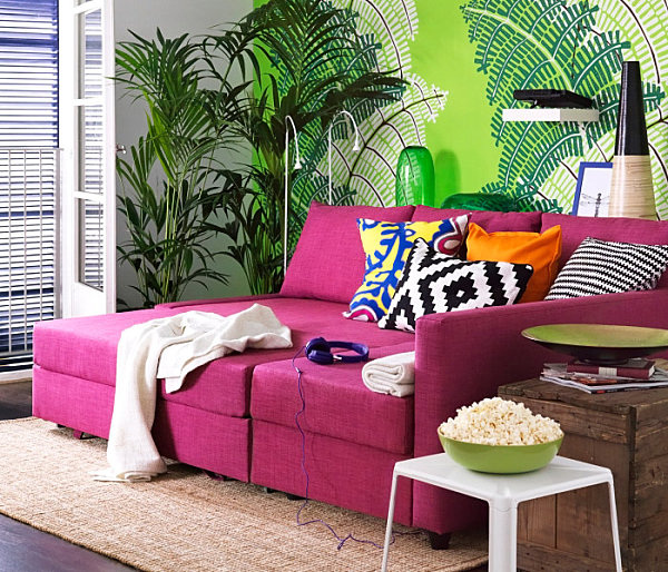
Another brand and retailer with a commitment to affordable modern design is CB2. The company continually refreshes its merchandise, providing variety (as well as great sales). Below we seeTriumph Red Lounge Chairs, crafted of red bonded leather and a steel frame with a red powdercoat finish: 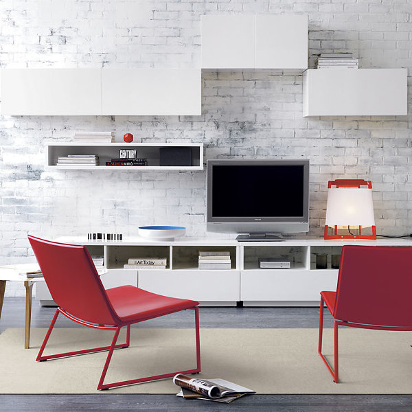
2. Incorporate used items, such as vintage finds. Bargain shopping also means being open to incorporating used merchandise, which can be purchased for amazing prices at locations such as thrift stores, antique shows, and online retailers like eBay and Etsy. [from Queens of Vintage] 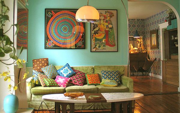
Many of today’s most popular spaces incorporate modern and retro finds for a unique look that celebrates a blend of old and new. Don’t be afraid of garage sale pieces! Some of your favorite decor items just might be used (or gently used) pieces you find when you least expect it. [fromDesign Vidal] 
3. Embrace a DIY mentality This design tip is one of today’s most popular and most celebrated money-saving techniques. Entire blogs are devoted to the art of the DIY project, and when an idea catches on, it gets maximum coverage. One of our favorite new DIY projects is this Geometric Stenciled Floor created by Sarah Sherman Samuel from Smitten Studio and A Sunny Afternoon. Instead of paying to re-tile her office floor, Sarah opted for the more budget-friendly strategy of painting the existing tile. Check out all the details at A Beautiful Mess: 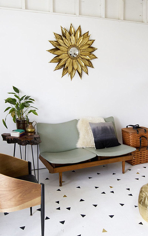
And of course, we’ve previously blogged about this amazing Painted Wood Wall Art DIY project from Salvage Love, created by arranging and layering painted wooden strips for a vintage look. Be sure to check out more great DIY inspiration at Decoist! 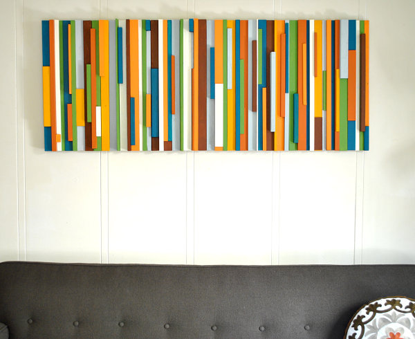
4. When in doubt, paint it. As we’ve seen with the painted geometric floor above, applying a new color or design to an existing feature is a wonderful way to make a big impact. This gorgeous living room uses a feisty shade of blue as a fabulous backdrop for hues such as turquoise and coral pink. Painting the trim and ceiling the same shade gives the room a saturated, designer look. [from Summer Thornton Design] 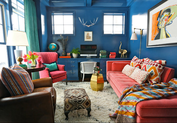
Painting furniture also makes a big statement, especially when it comes to freshening thrift shop and flea market finds like the chairs below. These bright yellow pieces were painted by A Beautiful Mess blogger Elsie to create a vibrant look in her dining room. Note how one consistent hue unifies chairs that represent a variety of design styles… 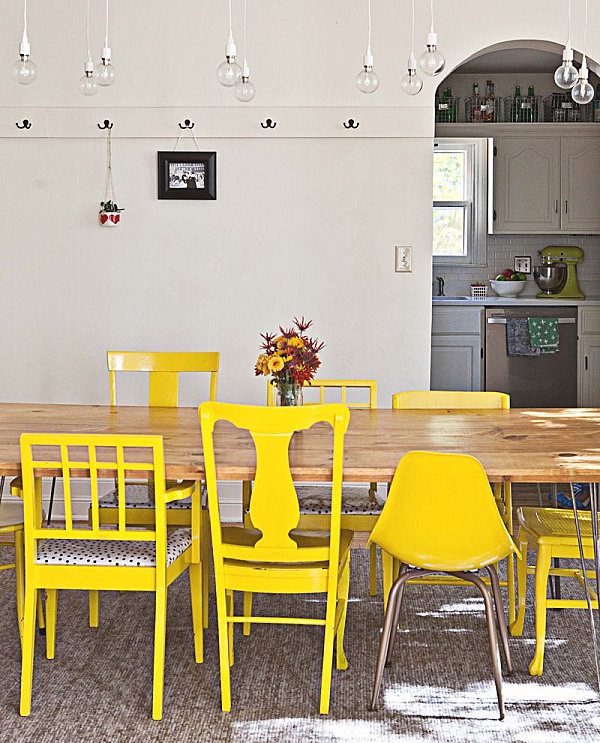
5. Know when less is more. When we move to a new place or tackle the design of another room in the home, our first instinct is often to fill every square inch of space. This puts a lot of pressure on us from both a decorative and a financial perspective. It’s OK to take your time designing a room, and it’s also OK to go with a more minimalist look. After all, a few quality pieces can make a bigger impact than a room full of clutter. [from A.R. Design Studio] 
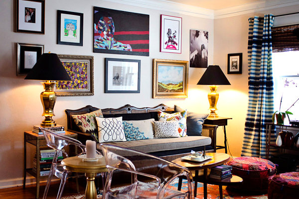
6. Celebrate eclectic design. While a unified, minimalist look is fun, it’s also exciting to go with an eclectic look in your space. After all, people are often drawn to a range of styles rather than one matchy-matchy look. When we combine a variety of elements, the result is an interesting reflection of who we truly are. [fromDesign Manifest] 
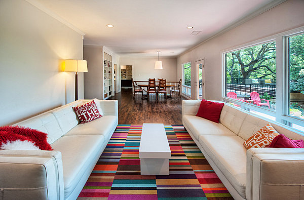
7.Anchor your space with a statement rug. Just as a fresh coat of paint gives a room a delightful makeover, a bold rug has the power to beautifully transform a space. And don’t think that buying a new rug has to be a financial burden. This JERNVED rug from IKEA is highly affordable and undeniably eye-catching: 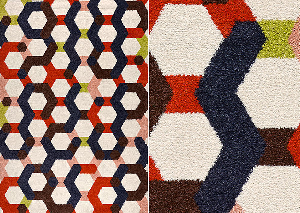
8. Make the most of lighting. Bold lighting makes a big difference. Really. A geometric pendant light or thoughtfully placed floor lamps can elevate a room to new heights. Don’t hesitate to go with a vintage fixture, such as the round pendant light shown below. [from Bright Design Lab] 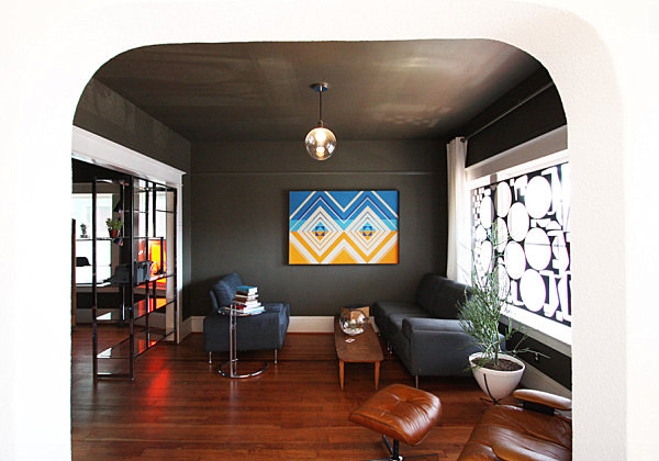
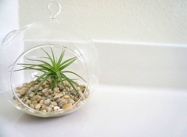
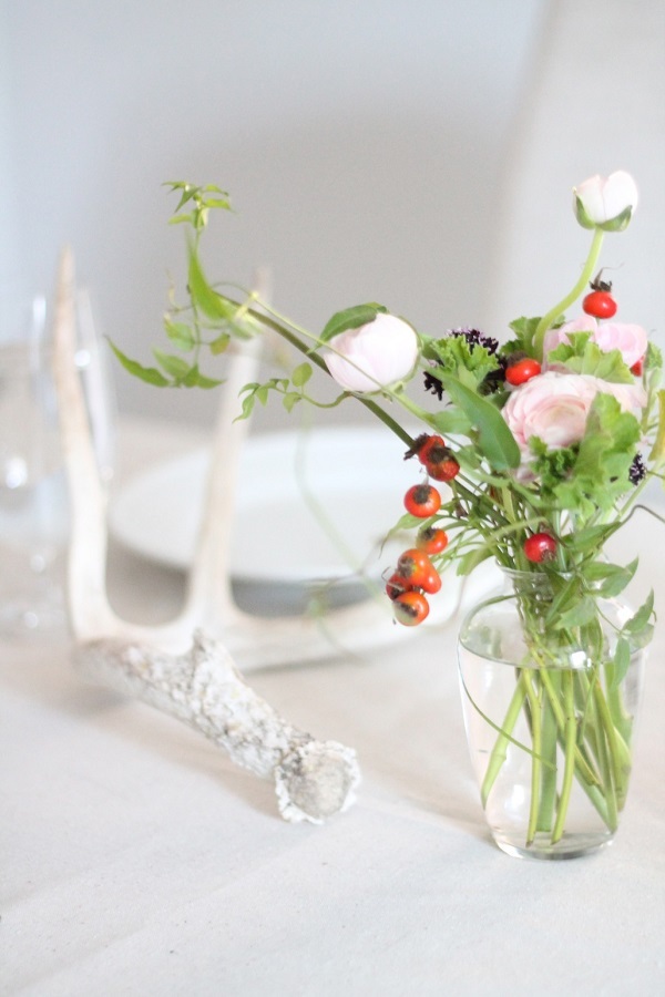
9. Harness the power of a beautiful centerpiece. It may seem like a minor touch, but a statement centerpiece is an easy, dramatic way to take a room up a notch. This next arrangement from Articulture was previously featured in a Decoist post on tropical centerpieces. Try incorporating succulents, air plants and artful branches into a creative centerpiece that’s also an instant conversation piece! 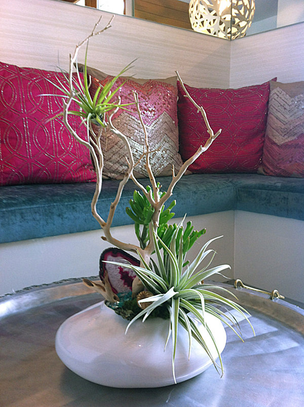
10. Group similar items for a powerful impact. There is power in numbers. Believe it or not, the simple strategy of grouping “like” items can make a big difference. Do you have a collection that could transform a shelf, wall or tabletop to a prominent display space? Why not celebrate a group mentality? [from John Lum Architecture, Inc.] 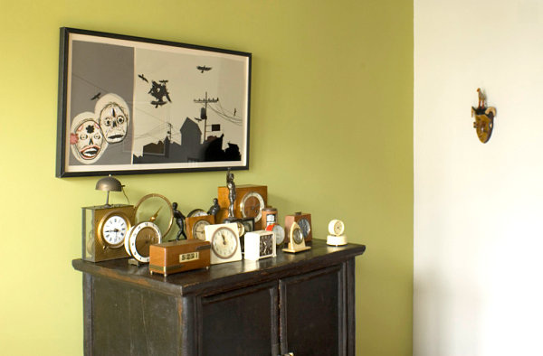
Not to mention, vintage collectibles add character and history to a space, often serving as true conversation pieces. We’ve previously blogged about these fun vintage arrows from Etsy shopGallivanting Girls. Not only are they stylish, they’re super colorful! [via Lovely Indeed] 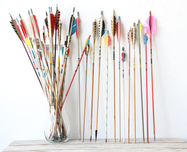
DIY Holiday Decorations Let’s start with a few simple ways to deck the halls, walls and surface-tops of your home. I came across this amazing decor idea from Bash, Please (for Design Love Fest), and it definitely made an impression on me. A striking Christmas spread is achieved with white shipping tubes, spray painted paper mache and glass ornaments, and evergreen scraps from the tree lot… 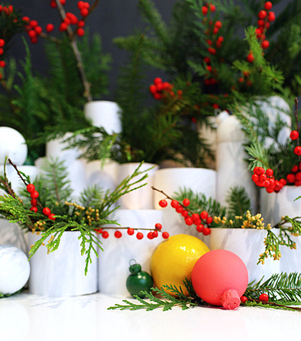
Don’t put the paint away just yet! These Painted Ornaments from Oh Happy Day are easy, fun, and colorful. By painting paper mache ornaments with thick acrylic paint, you can create a vibrant holiday look with an unconventional palette. And these ornaments look good enough to eat! 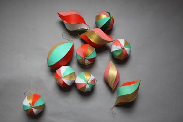
Print out the template, then construct a tabletop tree from paper. The look is sleek, geometric and modern! [via Instructables] 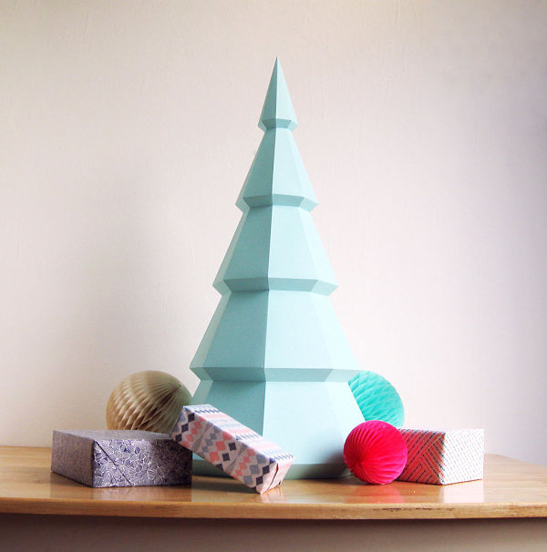
I plan on displaying the stockings over the fireplace, along with a festive garland. Which is why I was thrilled to find this DIY Paper Garland from Smock, which can be crafted from the paper of your choice. I may try this project using paper in shades of silver and gold… [via Monogram Paper & Gifts] 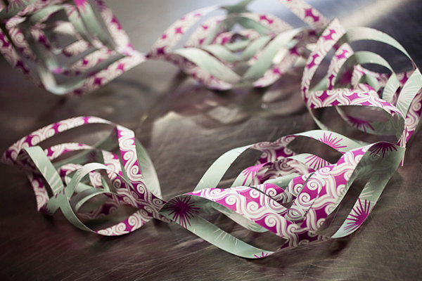
Every year, I like to make a few gifts for friends and family members. Don’t get me wrong–there’s nothing like getting a gift card to your favorite store. but there’s something special about a homemade present that’s designed with creativity and thought. Even if your gift is store-bought, you can still personalize your gift tags! How gorgeous are the marbleized gift tags below?! They are created by dipping wooden tags in a nail polish and water solution. Check out all the details at Design Mom: 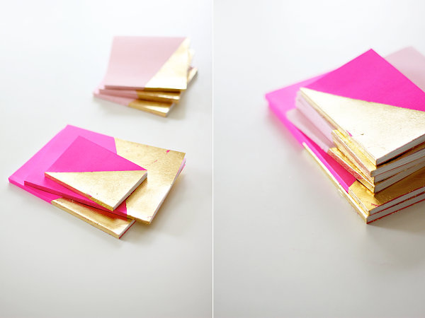
DIY Foodie Projects We end with a trio of foodie projects that are perfect for the DIY enthusiast! There’s nothing like a special recipe you prepare yourself. I’m on the hunt for the perfect holiday drink. Something I can enjoy when I don’t want to consume alcohol or caffeine. This Frost Bite Mocktail from The Little Kitchen might be just the beverage I need, especially since it’s a clever mix of fruit juice, soda, blueberries and mint: 
1. Aqua, White, Silver and Gold One palette I’ve encountered time and time again this season is a combination of aqua, white and metallic shades such as silver and gold. Crisp, refreshing and elegant, this palette is celebrated by retailers such as Target, which offers a range of selections in their Arctic Luster Trend Collection… 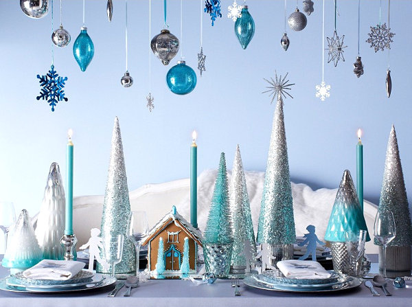
Not only is Target offering a range of glittering trees, this retailer has also manufactured gorgeous pillows in aqua and silver, such as the Threshold Foil Print Pillow shown below: 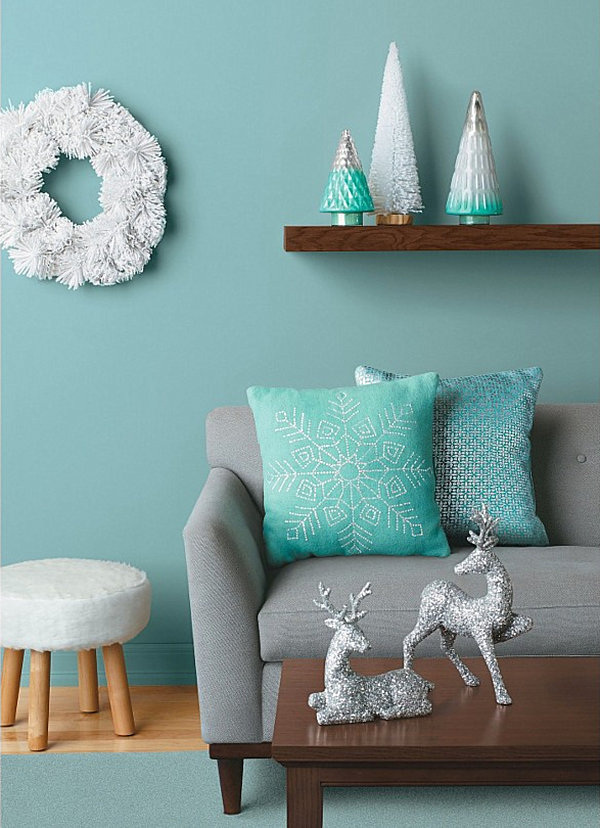
CB2 has also joined in on the fun, creating wintery vignettes in aqua, white and silver. Below we see the Silver Ball Garland and Aqua Glass Candleholders, which conjure images of snowy landscapes and chilly icicles: 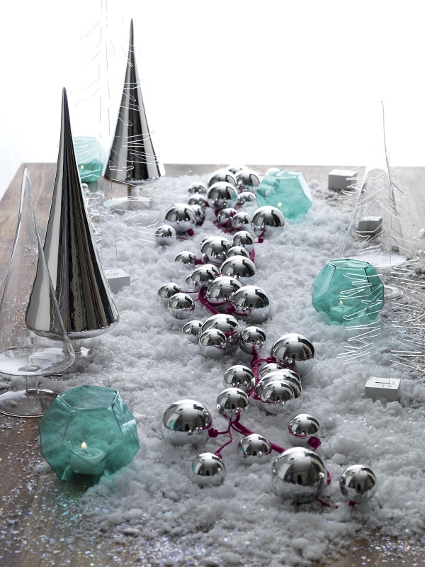
We now introduce some gold into the palette with another festive arrangement from from Target. Gold adds depth to this palette by providing a warm contrast to cool winter tones. Plus, gold is one of this season’s biggest trends! Of course it would find its way into the latest holiday decor… 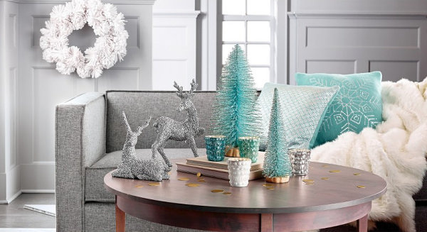
Speaking of gold, this next image is deliciously chic, thanks to aqua accents, gold embellishments and a contrasting glossy shade of white. It’s the Hexagon Candy Box DIY fromOh Happy Day, and it looks fabulous when juxtaposed with a minty blue… 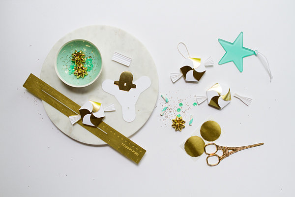
2. Teal, Amethyst and Fuchsia The palette above was crisp, refreshing and festive. The next featured palette I just can’t seem to get enough of is deep, rich and elegant. And retailers such as West Elm have truly brought it to life this season. These Agate Ornaments in jewel tones are sliced and polished to perfection… 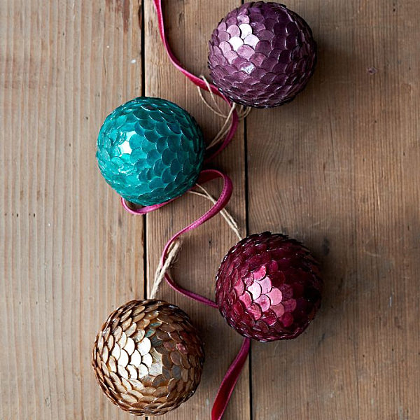
The retailer’s Handcrafted Sisal Birds can be used to embellish your holiday tablescapes, especially since they feature a range of rich shades. Inspired by forest birds, they also add some lighter tones, such as lavender and peach. The next featured image truly shows the depth to which you can take a jewel-toned palette by varying the colors. Don’t be afraid to combine rich hues with lighter shades: 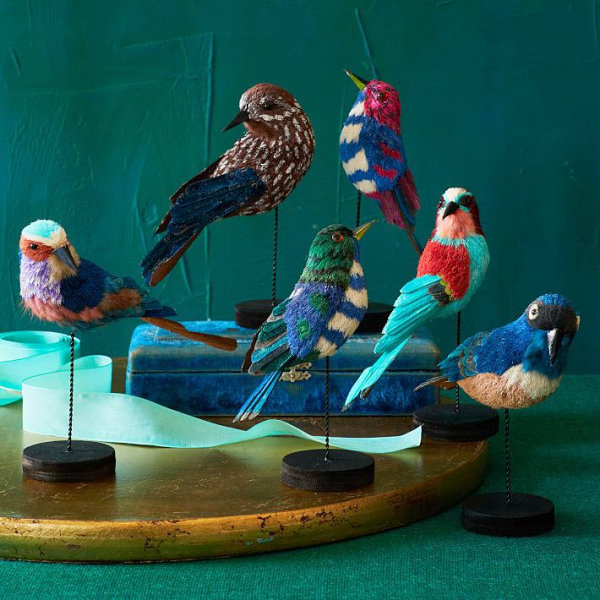
Add flowers in red and fuchsia tones to heighten the effect of the purple and teal palette. 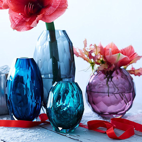
Jewel tones can also have a vintage effect, as shown by this gorgeous holiday wreath from Glittermoon Vintage Christmas. Shades of teal and magenta can be found throughout the design, creating a vibrant feel that welcomes guests when placed on the front door: 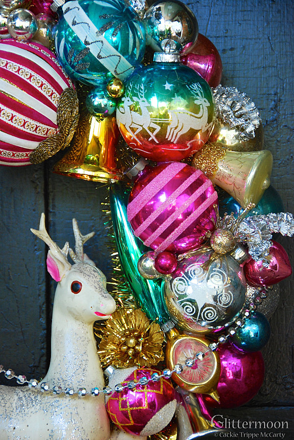
3. Red, Blue, Green and Gold We end with a palette of primary colors that conjures images of radiant toys, whimsical vignettes, and true modern design. This next palette is all about primary colors, folks! The Facet Ornaments from CB2 shine with their hexagonal faces, blending beautifully with the retailer’s other featured selections. 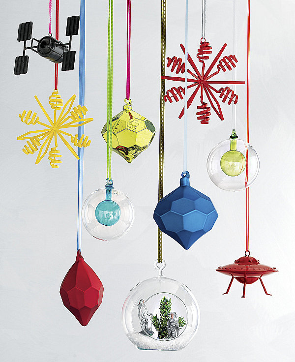
Need to make a vivid statement in matte? The Set of 6 Frosted Glass Ornaments from CB2 are perfect for the tree, or for a modern holiday wreath creation: 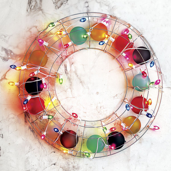
In addition to being wonderfully contemporary, a primary color palette also evokes the festivity of Christmases past. Yes, there’s just something nostalgic about this color combination. These Large Vintage Christmas Lights from Etsy shop Vintage Soup show us why… 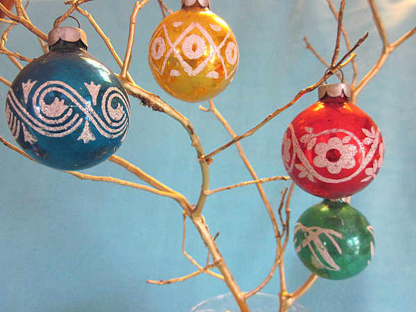
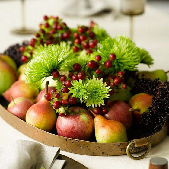
Grocery Store Chic Amy, author of Kenmore’s inspiration blog, added some color to her Thanksgiving table with mini pumpkins and gourds from a local grocery store. Because the design isn’t holiday-specific, feel free to display this DIY through the rest of fall. 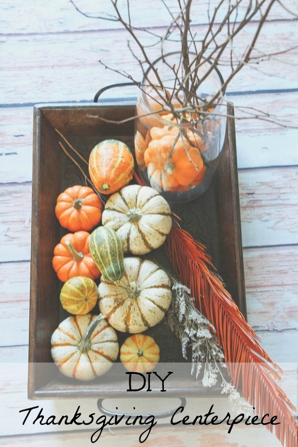

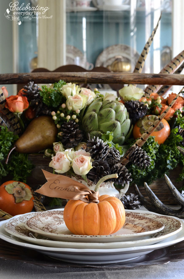
Jennifer of Celebrating Everyday Life added some unexpected elements to her grocery store spread- artichokes and pears. Mini pumpkins and autumn-hued roses complete this colorful centerpiece. 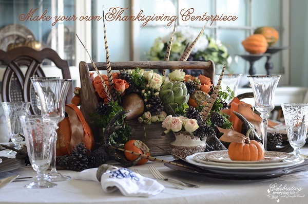
Kelly of Santa Barbara Chic skipped pumpkins altogether when creating this gorgeous arrangement. Though floral regulars such as dahlias appear among the bright-colored bunch, the persimmons steal the show. 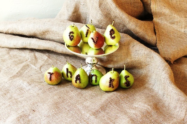
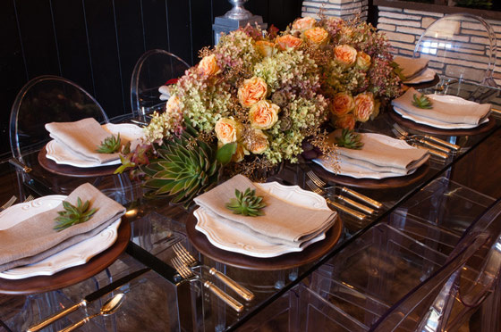
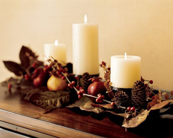
A Candlelit Affair When making this wooden box centerpiece, Courtney of Golden Boys and Me took a simple approach. A few wood planks and some dark stain were all it took for this stylish and versatile box. Add some candles and fall floral elements and you’ll have your own autumn-inspired centerpiece. 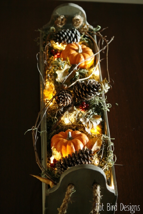
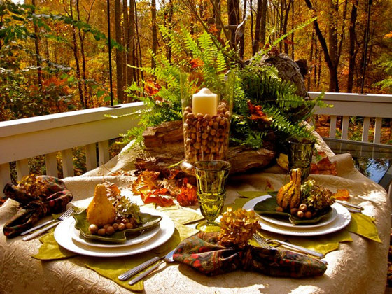
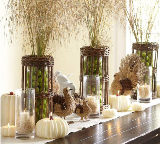
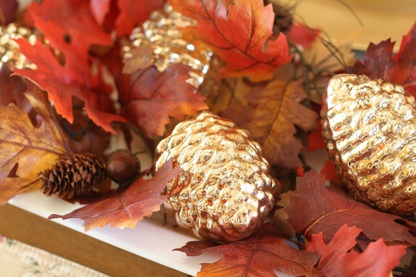
Simple Design Featured on Graphic Made, this fall-inspired centerpiece pays homage to the season’s natural elements. A plus- the pieces are all artificial, which means you can use this display year after year. 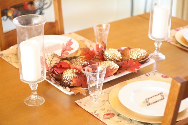
Clean and simple is the name of the game for this centerpiece DIY by Julie of Coordinately Yours. If you want to avoid the traditional color scheme of Thanksgiving centerpieces, this DIY is for you. 
Looks for Less Inspired by an expensive department store item, this DIY by Robyn of The Pink Peony of Le Jardin shows you don’t have to pay top-dollar for beautiful Thanksgiving décor. In fact, this mini ship cost only $5 to make- a holiday steal in any book! 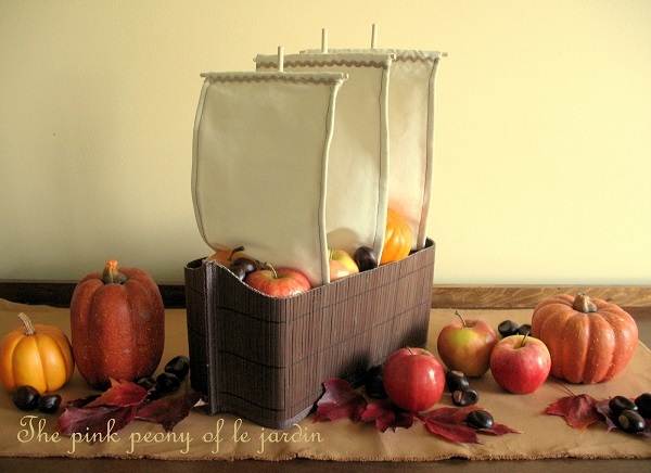
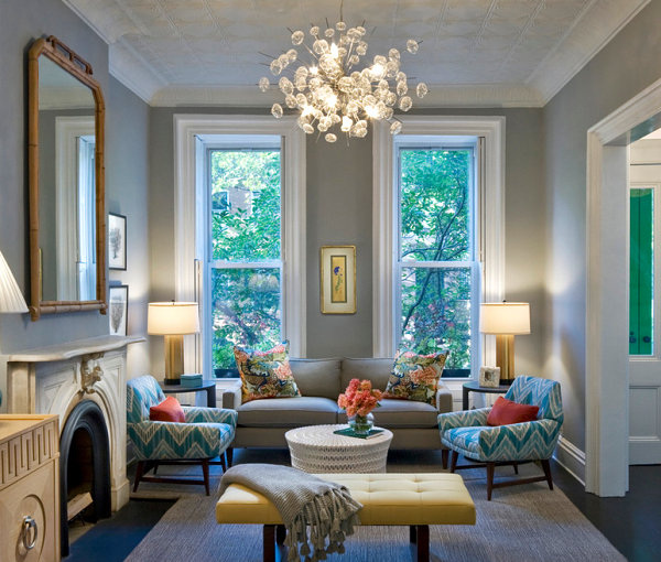
Orange You Crazy for Warm Tones? Ever notice how red is a popular dining room color? That’s no coincidence! Colors that energize, such as reds, oranges and bright yellows, are perfect for rooms centered around the preparation and enjoyment of food! But don’t assume that all warm tones with a rosy or orange-y glow should be kept out of living and sleeping spaces. Calmer versions of these hues, such as coral and peach, make a lovely addition to the most tranquil of rooms. Why? Because coral evokes the beach, and who doesn’t feel rejuvenated by a journey to the ocean? There are also bright versions of coral that make a unique, joyful statement in the home, as shown by the living room below. [from Easy Living] 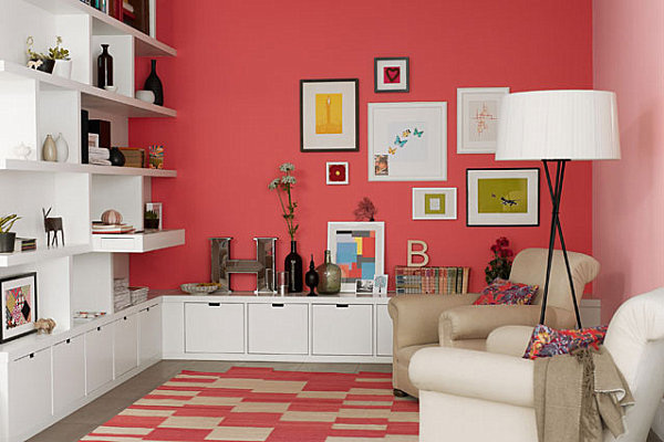
Peach is soft like the lightest hues in the sunset, and it blends well with sandy shades, as well as (of course) coral! Though the bedding below is ultra bright, the gentle wall color keeps this bedroom serene. [from Blue Sky Building Company] 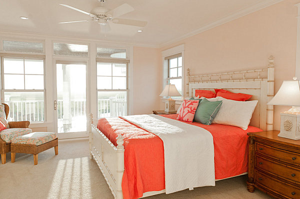
Coral can veer pink, or it can veer into rusty shades, as shown by this next featured living room. What a gorgeous blend of rich peach, warm coral, rust, sand and gray! This space is happy, energized and chill at the same time… [from S.B. Long Interiors] 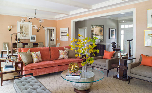
Coral also beautifully combines with blue, especially shades of navy. Not only does this blend create an elegant look, it makes a nautical statement that once again evokes the rejuvenating power of the beach (or the elegance of a sophisticated beach hotel)! [from S.B. Long Interiors] 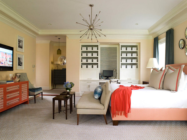
The same upscale look applies to the combination of peach and navy, which seamlessly integrates a warm glow with a rich, solid shade of blue to accent the room at hand. [from Irene Turner Interior Design and Renovation] 
Tranquil BluesShades of blue are soothing, steady and powerful (but in a chill way). Not to mention, they combine well with blue-gone-glam hues such as lavender. Notice the touches of coral in the room below as well?! [from S.B. Long Interiors] 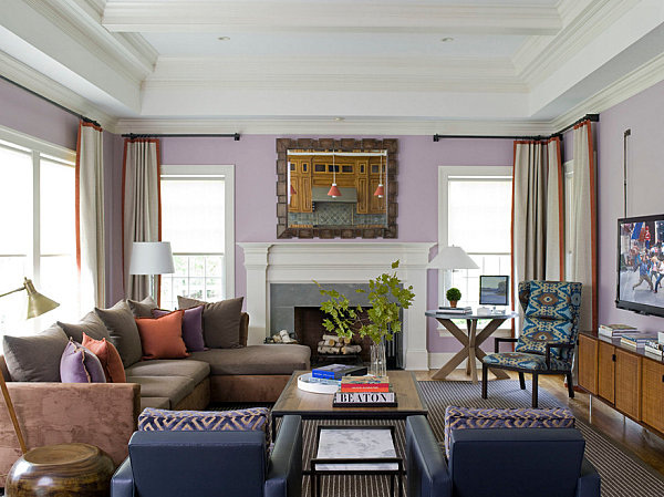
Royal blue is regal, isn’t it?! This strong shade can be accented with a range of colors. We love how the next featured space tones it down a bit by going with unexpected pops of color in hues such as green, brown and pink. [from Easy Living] 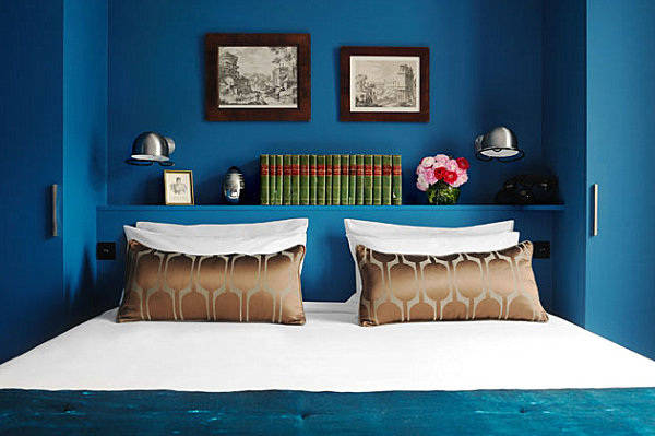
In fact, there’s something about a srong shade of blue that’s, well…. interesting. Call it decadent or enticing. Rich shades of blue definitely take things up a notch in a way that is both calming and evocative. And when your space demands a second look, it’s definitely a winner! [from Vanessa DeLeon Associates via Zillow] 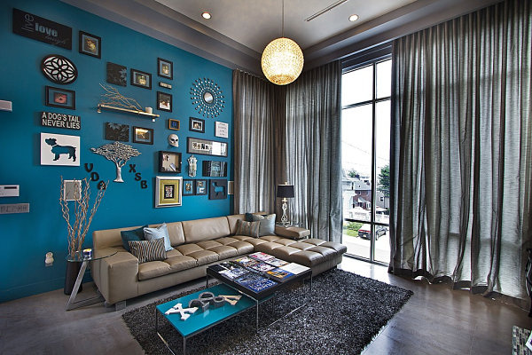
Flowing water is relaxing and heavenly, isn’t it? And there’s just something heavenly about the Angela Adams rug below. Like a fairy tale land where bubbling ponds hold scores of happy fish, this rug has a blissfully natural look that also channels the waves and foam of the ocean. Maybe that’s why the rug is called “Ocean“! Undeniably calming, it also invites you to escape, and that’s just the kind of vibe you can’t help but desire in the living room… [from Lulu Designs Online] 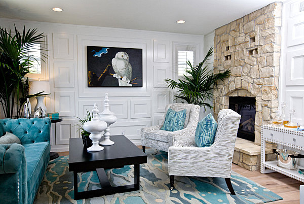
We now head into blue-meets-green territory, beginning with the deep teal living space in the next image. Once again, we have a rich, extravagant look that is also calming, thanks to its understated yet powerful feel. Note how furniture in shades of cream is the perfect counterpart to the shade on the wall. Also note the lovely way gold accents blend with this space. [from Design Crisis] 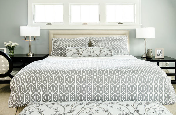
|
NellyLoving flowers, design and arrangement. Archives
June 2017
Categories |
 RSS Feed
