|
Emerald GreenOne of the most beloved color forecasters is Pantone, and they have officially announced theirColor of the Year for 2013: Emerald! Emerald green evokes the vibrancy of nature while at the same time conjuring a jewel-toned richness that can’t be denied. Whether you picture a faceted gemstone, the ridges in a sample of malachite, or your favorite plant when you gaze upon an emerald space or accent, you’ll love incorporating this vivid shade into your interior. 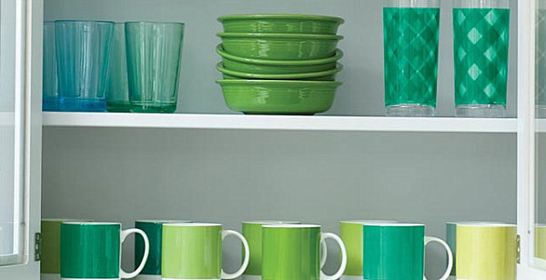
Below we see a living space that blends yellow- and blue-tinted shades of emerald green. The result: a layered, powerful palette. [from Rikki Snyder Photography] 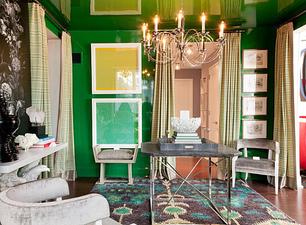
LilacAnother popular hue for 2013: lilac. In fact, shades of purple are on many a forecast list, shown in spaces that soothe with calming colors, such as the bedroom below. [from Housetohome] 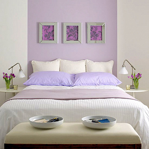
In fact, one popular trend for the next year involves mixing shades of purple, from lavender to violet and eggplant. Note how the purple hues in the next space create a deep, rich look that is both welcoming and glamorous. [from Let me be inspired] 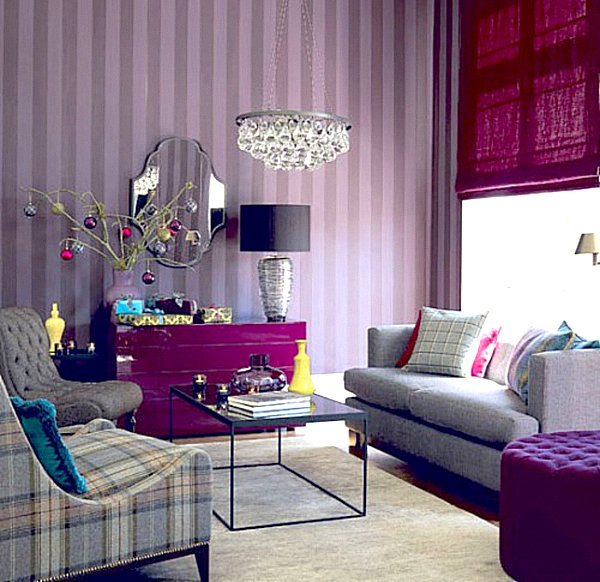
Mustard YellowRadiant yellow will steal the show in many a 2013-designed room. With tones of the sun and a definite golden glow, this friendly shade works well with colors such as tangerine and eggplant. Note the warm vibe of the living room below. [from HGTV.com] 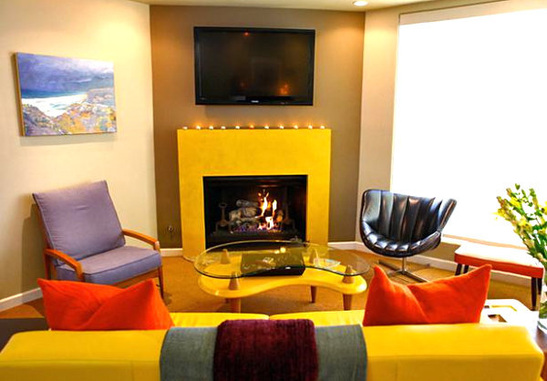
Mustard also blends peacefully with shades such as brown and citron green. In fact, this color combination creates a vintage look that is perfect for modern spaces. Note the earthy hues in the charming room below. [from Little Lovables] 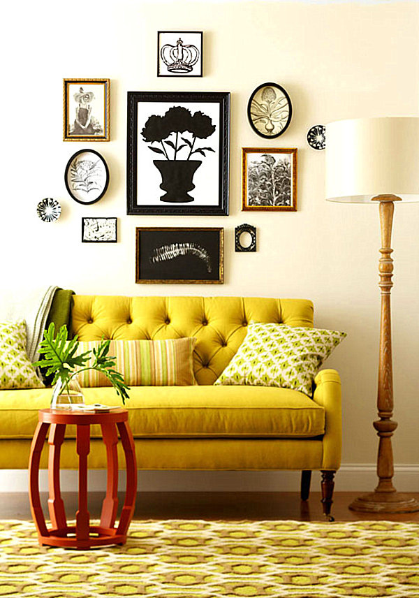
Ocean BlueSoothing shades of blue can be found on many a color forecast list. Not to mention, blue mixes well with lighter and darker shades of the same color. Note the prominent ocean blue shade in the room below, as well as the way it stands out when juxtaposed with royal blue, navy blue and crisp white. [from Ellenor Industries] 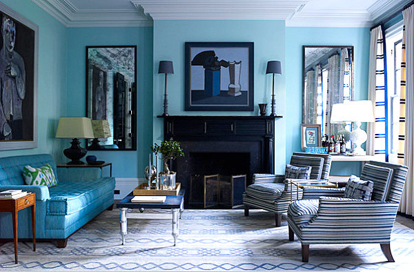
The soothing blue wall color in the room below beautifully combines with warm, neutral tones, such as light golden brown. Which makes sense when you picture the sand and sea of the beach in perfect harmony! [from DesignShuffle.com] 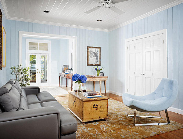
Fiery OrangeTangerine was Pantone’s color of the year for 2012. So why would it fade away so quickly in 2013? We’re not surprised it’s still on this year’s list of popular colors! In the space below designed by Brown Davis Interiors, Inc., the hue is strategically used to accentuate a recessed ceiling. [via Houzz] 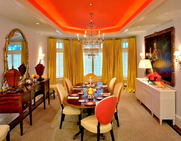
Don’t forget the joyful blend of orange and pink! And a dash of brown. The living room below features a striking orange and pink combo, as well as earthy wooden tones. [from Centsational Girl] 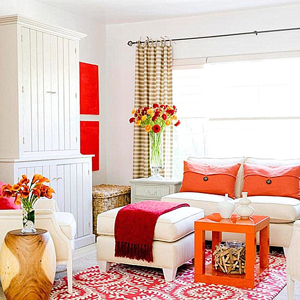
Cloudy GrayWhile the allure of eye-catching colors can’t be denied, the importance of neutrals is just as significant. Gray has been included in many of this year’s color palettes, for it soothes and calms, keeping the ultra-radiant shades in check. For example, note how well gray mixes with the teal green pillows in the room below. [from Decor Pad] 
Don’t be afraid to bring in rich shades–with gray walls, there’s room for deep accents. In the next featured space, royal blue is a stunning contrast to the background hue. [from Atmosphere Interior Design, Inc. via Houzz] 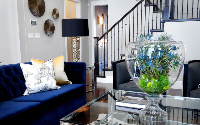
0 Comments
Your comment will be posted after it is approved.
Leave a Reply. |
NellyLoving flowers, design and arrangement. Archives
June 2017
Categories |
 RSS Feed
